
Sunday, 19 December 2010
Contents page mock up
Saturday, 18 December 2010
Front cover draft

Friday, 17 December 2010
Double page spread draft

Thursday, 16 December 2010
Name ideas for my music magazine
So far I have decided I want my magazine to be an indie magazine, which is similar to NME and can be it's competitor. I have decided to follow the conventions of indie magazines and feature articles on the front cover and in the contents relating to indie artists and gigs. I therefore need to decide on a name for the magazine which best suits the genre and have listed some ideas below:
Slam!- This represents excitement which is conventional for an indie magazine.
STRUM- This relates to the indie genre because most indie artists play guitars and the idea is that you strum a guitar.
Gig it- This relates to the indie genre because most indie fans will often go to gigs, meaning this name is more likely to attract the target audience.
Rock out- Indie is associated with rock music, however this name may be best suited for a magazine that focuses purely on the rock genre.
Bassline- This may be suitable as most indie bands have a bass player, so it associates with the indie genre and also attracts the target audience.
Tuneage: This may be appropriate as it is a play on words with the word "tune" which is a popular word to describe music, however this name does not relate directly to the indie genre.
Wednesday, 15 December 2010
Mojo double page spread

Institution: The institution producing this double page spread is Bauer media. On Bauer's website it shows the different platforms of Mojo, which are the magazine itself, the website and also a link to twitter which gives the audience a chance to interact with each other.
Ideology: The title "The best of both worlds" promotes the idea that the artists perform just as well in a duo than in a band. The background of the brick wall gives the impression that the artist's music and the magazine has a rough edge to it, as we typically associate a brick wall with a rough area. The title also fades from a nude colour font to white which shows the transition from one world to another, which is what the article is about. The black and white and brick wall also reflect the name of the new band as it is called "The Last Shadow Puppets" as when we think of "Shadow" we generally picture darkness. I also noticed that on the brick wall the edges are faded, which could show that the artists' old lives are fading away as they are going into something new.
Audience: The audience is described as mainly male, we can see evidence of this on this article as it is featuring male artists who's pictures are also very dominant on the spread, as they take up a lot of space with the use of medium shots. The audience is also described as being affluent, and this links to this article because we can see the artists are smartly dressed, and it is also worded in a way that would attract a more middle class audience, for example the title "Best of both worlds". The audience are likely experienced with their knowledge of indie music, and are likely to even be musicians themselves who are looking for new ideas and ways to better themselves. This is one of the reasons why they would be interested in reading this article as it is about artists making change in their careers.
Representation: My initial thoughts on the representation of this double page spread is it is represented as dark and gloomy with the use of black and white and the brick wall. However the white represents innocence, and also that there is a light at the end of the tunnel for the artists. The artists also appear relaxed and laid back on the photos, as one has their arms folded and is not looking at the camera. This shows a positive representation as the artists appear happy with where they are in their careers.
Tuesday, 14 December 2010
Mojo contents page

Institution: The institution producing this media text is Bauer media.
Ideology: It appears one of the ideas behind this media text is to promote older bands and music, as the majority of articles are about retro bands, which gives the impression that the magazine is trying to encourage the audience to find out more about the bands. However Mojo also features newer bands, which shows that they are also trying to promote the newer bands. We can tell older bands are being promoted due to the use of black and white photographs. There is an article featured called "X-word" , this is usually a phrase used in reference to a taboo word, therefore gives the impression that the magazine is rebellious. One of the pictures is animated with use of the colour red which represents danger, how ever the use of animation gives the idea that the magazine is aimed at a more fun loving audience as well.
Audience: The audience for this media text is most likely to be people in their late 20s or older, and is mainly male. We can tell it is aimed at this audience because it features older bands, and uses black and white photos along with black text against a white background. How ever, they also may be trying to widen their target audience as there are a few more recent bands featured such as "Hello Goodbye", and 2 photos and part of the background are in colour. This shows that they are possibly trying to liven it up a bit to perhaps aim for an audience who are in their early to mid 20s and older, as this age group tend to be more lively.
Representation:All the artists in the photographs appear to be smiling, therefore represeting Mojo in a positive way. The article featured "X-word" could represent Mojo in a negative way because this phrase is often associated with taboo language. However , the article featured "50 greatest reggae albums" represents Mojo in a positve way because it gives the audience the impression that Mojo only features the best artists, music and albums. There is also little use of the colour red which represents the magazine as being dangerous and rebellious, meaning the magazine is represented in a negative light.
Monday, 13 December 2010
Mojo front cover

Institution: The institution producing Mojo is Bauer Media. Mojo is described by Bauer media as being a mixture of classic bands to modern day indie bands, and to be cutting edge and has quality. The platforms Mojo magazine runs on is the magazine itself and its web page.
Ideology: One of the first things I noticed relating to the ideology on this front cover is the use of exclamation marks such as "Neil Young rants!" which shows one of the ideas behind the magazine is excitement. Where it says "The Music Magazine" over the masthead it implies that the producers of the magazine are trying to give the idea that Mojo is the only music magazine of quality. The magazine appears less eccentric than other music magazines as it uses a bland colour schem of white and grey, this may have been done to give the impression that the magazine is more down to earth than the average music magazine. Where it says "Their 101 greatest songs" to the right of the page, it portrays the idea that Mojo magazine only features artists with well known songs that have made a hit. It also reflects the magazine because it gives the impression that if Mojo features great music, it must be a good quality music magazine.
Audience: Bauer media describes the audience for Mojo to be passionate about music and 72% of the readers are male. They are also 36% affluent, heavy consumers of music, and genre and decade are secondary to quality. This audience profile implies that the target audience is more mature, possibly in their late 20s to early 30s. Also, the use of more bland colours on this front cover indicates that the audience is down to earth, and that they want to listen to music that is more down to earth as well. The audience are also more likely to be the type of people who enjoy listening to retro music, as this particular front cover features the beatles. This also means that they are quite likely to be collectors of things like old records, which shows that they have a passion for music.
Representation: The first thing that came to my mind is that is is represented as being quite dull because of the use of dark colours, and because the artists featured look expressionless. However it is also represented as being exciting as it says "The Album That Shocked The World!" under "The Beatles". This represents the magazine in a positive light because it shows that the magazine features reliable information about music produced by the bands. I could also be represented as having a rebellious streak because one of the band members featured on the front cover is smoking. One of the articles featured on the front cover is "101 greatest songs", which the use of the word "greatest" represents the magazine in a positive way because it shows the magazine only features the greatest bands/ songs.
Sunday, 12 December 2010
Kerrang double page spread

Language: The first thing I noticed about this double page spread is the colour scheme used. The colour scheme used is red, black and white. The colour red represents danger, whilst the colour black shows that the mood is dark. This has been done because the target audience of the band featured views the band's music as being rebellious, but also dark at the same time. Another aspect of language used is that the photographs are in black and white, which also shows that the band's music is dark and of the rock genre. The white font is used against the black background to stand out. On the main picture used, the audience cannot see the band member's face as they have their head down, which is another aspect of language used to create a sense of darkness and sadness.
Institution: The institution producing this double page spread is Bauer Media. One reason we can tell it is Bauer Media is it is featuring and already well established rock band, which Kerrang is known for doing.
Ideology: One of the first thing I noticed was the title on this double page spread "We are being the best MCR we can be" which shows that the ideology of the band is that they always try their best, and also shows that Kerrang only feautures the top well established rock bands. Also the font colour of the part which says "the best MCR" is in white which represents innocence, which interestingly is a contrast with the red which represents danger. The black and white photography shows that their music is dark, which in turn shows that Kerrang has a darker feel to it. In the corner of the page it says "World Exclusive!" which gives the impression to the audience that My Chemical Romance is a top band, which in turn shows Kerrang is a top magazine that can gain exclusive access. At the right of the page it says "The Lowdown" then lists My Chemical Romance's latest tracks, which shows that Kerrang is up to date which the latest rock music, despite being centred around already well established bands.
Audience: The audience for this double page spread are individuals who have experience in the rock music genre, one of the indicators of this is the fact it is featuring My Chemical romance which is an already well established band. The target audience is those in their mid to late 20s, as Kerrang features bands that have already been established for a number of years. The audience of Kerrang are also likely to be people with the same sense of style as My Chemical Romance, as it is the stereotype that people who are interested in the rock genre dress similar to the artists.
Representation: One of the things I noticed is that "My Chemical Romance" under the title is highlighted, which represents the band as being important. The red used as part of the colour scheme represents the band as being dangerous, which also represents Kerrang as being dangerous because this is the type of band they are most likely to feature. I noticed that on the photographs non of the band members appear to be happy, which represents the band's music as being dark and depressing, which represents Kerrang in a negative way. The use of exclamation marks such as "World Exclusive" represents the magazine as being exciting, and also Kerrang is represented as being up to date as it says in the top left corner "Visit http://www.kerrang.com/ for all the latest news" which shows that Kerrang is up to date with all the latest news about rock bands, which represents Kerrang in a positive way.
Saturday, 11 December 2010
Kerrang Contents page

Institution: The institution producing Kerrang is Bauer media. It has possibly been produced to be in competition with NME as they both feature some of the same bands, however Kerrang has a slightly different target audience to NME.
Ideology: The first thing i noticed relating ot the ideology is the quote near the top of the page saying "Angels & Airwaves? Never heard of them. But Blink 182's not a bad band". This shows that the magazine is focused around well established bands and does not tend to feature new bands that are not yet well known. The page is mainly filled with pictures of different bands rather than writing, which shows that the magazine makes the artist look like the most important thing in the magazine, and it shows that they are the main focus. Kerrang also tends to feature rock bands over indie, and the bands appear to have a negative aspect to them. For example one of the bands featured is called "Taste of chaos", which represents rebellion. Another band featured is "The Blackout", which represents darkness and negativity.
Audience: Bauer media describe the target audience for Kerrang as Individually minded and muscially experienced. This indicates that the target audience are people who know alot about the rock genre, and maybe are people that are musicians themselves. It also indicates that the magazine is aimed at those in their mid to late 20s rather than early 20s or teens because the word "experienced" is used when the target audience is described. It also comes under Men's Entertainment on Bauer Media's website, which shows that the target audience is men. It appears to only feature well established bands as it says " Angels and Airwaves? Never heard of them. But Blink 182 is not a bad band". Also, the artists featured appear to be aged late 20s to early 30s, which is more likely to attract and audience within the same age group.
Representation: From this contents page Kerrang is represented as being quite rebellious, but also appears to be more down to earth at the same time as it is aimed at a more mature age group. It appears rebellious because it features a band called "Taste of chaos" and has a live reviews section, which indicates although it is aimed at a more mature audience it still features live music, and also features upcoming gigs. It appears down to earth as it appears to only feature well established bands, thats have most likely been around for a number of years, and the audience are likely to have followed them with their success.
Friday, 10 December 2010
Kerrang front cover

Institution: Kerrang is produced by Bauer media, which is a big mainstream company producing various types of magazines. This means that Kerrang is possibly in competition with NME, although the target audience is slightly different as Kerrang focuses on rock music rather than indie. This means that Kerrang may be a potention competitor for my magazine. Kerrang is not only a magazine but is also a radio station, TV Channel, has a website and has its own award ceremony. This means that people who listen to or watch Kerrange will then go and buy the magazine, and vise versa, therefore creating profit for Bauer media.
Ideology: The ideology on this front cover appears to be the promotion of excitement, as it says things like "Metallica storm the UK!" which with the word "storm" and the use of an exclamation mark indicates that Kerrang is fast paced and up to date. Another example is the phrase "Northern Uproar!" used to describe the main band featured. This shows that that the band featured are the latest thing happening, which is what the target audience what to see. The masthead also looks rough because it is in black and has jaggered edges, which indicates that the magazine is a rock magazine because the rock genre is often associated with being rough. Also, the black which is part of the colour scheme indicates that the magazine is quite dark, and it is also a colour which is associated with rock as a lot of the artists wear dark clothing. The red in the colour scheme indicates danger, as rock is often associated with risk and danger as the majority of the artists are streotyped to be drug and alcohol addicts.
Audience: Kerrang describes their target audience as Individually minded, independant of thought and muscially experienced, an audience defined by attitude, passion and loyalty. This front cover gives the impression that the target audience is mainly male as it is dominated with male artists, and all the articles featured appear to be about male artists. It is also listed under Men's Interest on Bauer Media's website. The front cover indicates that the target audience would be young people as it has been designed to look exciting and fast paced, which suits the personalities of the audience. However, Kerrang's age group of the target audience appears to be a bit bigger than NME's because Kerrange features artists that are already well established and that have been around for years, whereas NME features new and upcoming artists who are generally quite young.
Representation: The first thing I noticed about the representation of Kerrang's front cover is the colour scheme of red,white and black which is used. The red and black represent the magazine to be quite dangerous. Also the use of exclamation marks represents the magazine as exciting. Another aspect which represents danger is that the majority of the artists featured on the front cover appear to have tatoos, which makes them fit into the stereotype that is associated with rock musicians. The magazine is represented as rough because the masthead and large font on the page have jaggered edges, and also the common stereotype of people with alot of tatoos is that they have a rough personality. As it features a lot of articles and different pictures on the front cover the magazine is represented as having a lot going on, which reflects the target audience because they are expected to be the type of people that have a lot going on in their lives.
Wednesday, 8 December 2010
LIIAR Analysis of NME Double page spread

Language: The first thing I noticed about this double page spread is the white/grey background. This has been done so the black font stands out.The first thing the audience will notice is the text 'USA' which takes up the majority of the page, however fades into the background as the font colour is grey so it blends in with the background. Also there is a red and white striped covering over the box which stands out against the white background. This layout is unconventional for an indie music magazine as it is down to earth and sophisticated whereas it is conventional for the layout to be quite rebellious and in your face to relate to the artist on the double page as the stereotype is that indie artists are quite eccentic. This sophisticated layout has been used because the artist is viewed as more sophisticated than the average indie artist by the audience. There is also a play on words on the title as this article is promoting her song "You got the love" and the article is titled "USA got the love" which is due to the fact the article is also covering her sucess in the USA. She is dressed in all black which is a dominant colour along with the red on the striped flag. This could mean that she is dominating the music industry in both the UK and USA.
Insititution: The institution that produced this is NME, we can tell this because the story is focusing on a new artist and new song and NME stands for New musical express.
Ideology:The first thing i noticed relating to ideology is the play on words with "USA got the love" which is promoting the idea that sucess and good music is in the USA. The first line of the article is "She's 2009's biggest success story" which is promoting the idea of success to the audience, this is partly because successful artists appeal to them. Also, as she appears a dominant character by what she is wearing and sitting high up on boxes which are underneath the flag, it promotes the idea to the audience that in order to acheieve success you need to be confident. Her black clothes, red hair and red colour on the flag also indicate her dominance as an artist.
Audience: The audience for this media text are likely to be eccentric people as the artist featured in this double page spread has an eccentric image. As the ideology of this particular double page spread represents dominance and success, this is likely to be what the audience aspire to achieve as they look up to her, particularly as the age range of the target audience is 15-24. NME is more likely to be read by males than females, however this particular article appeals to the female audience as it features a female artist who is becoming successful in the music industry, and young girls aspire to success.
Representation: Generally, this double page spread is represented in a positive way due to it being foucuses around success. However, there are some things which represent negativity. The second line of the article is "So why is Florence Welch lying on the floor attacking herself?" which represents negativity because it indicates that the artist is stressed out with the concept of suceeding in the US.
Monday, 6 December 2010
LIIAR Analysis of NME - Contents page

Language: The first thing I noticed was the red font on the title NME at the top of the page , this is conventional because the masthead on the front cover is also in this font, meaning the audience can recognise the title of the magazine. The second thing I noticed was the contents are listed down the right hand side rather then the left which is unconventional, as in most music magazines the contents are listed down the left hand side. This could have been done to make NME stand out, as because the audience is interested in the indie genre they are also likely to be people that want to stand out. The photographs of the band are also directly in the middle of the page which is unconventional because it is most common in music magazines for the photos to be on the right hand side opposite the contents. I noticed that the contents are listed in black and white font which stands out. The date of the magazine is listed at the top right just under the title, which is conventional for music magazines. There is also a band index, which is with a red background with black and white font which helps it stand out and makes it one of the things that the audience notices first. I noticed that in the middle under the picutures of Oasis it says "The moment that.... Oasis kicked off their world tour" which is conventional because as soon as we see the image we expect to see and explanation as to what it is about. It is also in large black font which makes it stand out, and I also noticed as it starts with "the moment that.." in smaller font above the rest of the sentence which indicates that the second part of the sentence " Oasis kicked off their world tour" is actuallly more important as it provides the information the audience want to hear.
Institution: The instituion that produce NME is IPC media. NME is the only Indie magazine produced by IPC media , which makes it unique and an ideal magazine to be in competition with, as it is one of the only Indie magazines around. IPC also make NME stand out from other music magazines as they use an unconventional layout for the contents page by putting the contents on the right hand side with the images directly in the middle.
Ideology: The ideology refers to the ideas that the text is trying to put accross. The first thing I noticed was the middle of the page underneath the photograph of Oasis was that it said "The moment that....Oasis kicked off their world tour". The use of .... creates suspension, which means its leading up to something quite important. Also "Oasis kicked off their world tour" is in a much larger font than the former part of the sentence which emphasises that it is important information for the audience, as it is also the first thing the audience notice. Another thing I noticed is the use of exclamation marks, which indicates that NME is trying to promote the idea that the magazine is exciting to its target audience. NME focuses around new up and coming bands, hence why it is called New Musical Express. This means that part of the reason why they try and promote the idea of excitement is that they want to make new bands sound exciting. The first thing listed on the contents is news, which means the first thing the audience are going to want to read about is the news relating to their faveriote bands and to find out which bands are new and up and coming.
Representation: Generally the magazine is represented in a positive way, as the ideology is excitement, and showing the importance of events relating to the indie bands it features. Under the "Live!" heading on the contents it says "This weeks best gigs" which reflects positively on the gigs it has featured, because it is promoting the idea that NME features the best bands and gigs. It also says on the bottom right hand corner "The UK's no 1 gig guide starts p58", this is another thing which represents the magazine positively as it is trying to tell the audience that it provides the best guide to gigs and the most relevent information that the audience wants to read. At the bottom of the page i noticed it advertised for subscription saying " Subscribe today.. save 33%" Which promotes the magazine positively as it is trying to tell the audience they should subscribe.
LIIAR Analysis of NME

Institutions: NME is published by IPC Media, which also produces magazines such as Look and Marie Claire. The audience can tell it is produced by IPC because the website for NME is advertised below the bar code, and the link to the website for IPC can be found at the bottom of the homepage. NME is also the only Indie music magazine produced by IPC, and it has little competition as other Indie magazines such as Q have slightly different target audiences.
Ideology: The ideology means the ideas behind what is advertised on the front cover. I noticed that the articles featured on the front cover revolve mainly around new music such as it advertising My Chemical Romance's new album and the come back of Babyshambles. This means the magazine is trying to promote the idea that it is important to keep up to date with new music, and this is also what the target audience are likely to do as they are likely to regularly go to gigs and download new music.
Audience: The target audience for NME is young affluent people between the ages of 16-24. NME is specifically aimed at those who keep up with the latest music, as NME stands for New musical express. The target audience are people that regularly go to indie gigs, and are likely to want to hear about new up and coming bands as well as the bands that are already well established. They are people that regularly download music and research the latest indie music news.
Representation: The front cover represents NME in a positive way because the main band featured on the page appear smiling, and are also posing in a way which reflects a rebellious nature, which is often associated with the indie genre. The magazine is also represented positively with the article New Album: The Ultimate Review which indicates to the audience that NME provides reliable and in depth reviews. As the main photograph of the band is a medium shot which takes up the majority of the front cover it represents the magazine as being exciting and up to date.
LIIAR Interpretation of the brief - Music magazine

Language: I will be using a Masthead, barcode, price, date, issue number, and titles of four or five featured articles on the front cover. On the contents page I will write a full contents of the articles featured in the magazine along with text at the top to make it stand out. On the double page spread I will feature an interview with an artist and a title of the article. The language refers to the messages the media puts accross to the target audience. The layout should be designed for an audience which is interested in the indie genre and style. For example Indie magazines usually feature an artist / band on the front cover which will take up the majority of the page. It is also conventional on the front cover to have advertisements for gigs/ tours of bands as this attracts the target audience and helps us establish it is a music magazine.
Institution: This refers to which company produces the magazine. I will be working to compete with IPC as they producse NME which is the same type of magazine and target audience as mine. I will imagine I am producing my magazine for Bauer media because i think there is a gap in the market for an Indie magazine like mine, as the magazines it produces such as Q and Kerrang are more tailored towards the rock genre, whereas IPC already caters for my target audience.
Ideology: The ideology is a set of beliefs and attitudes that a group of people share in common. For example magazines such as NME aim to publish articles based on beliefs that young people who are interested in the indie genre have. Magazines often publish articles that link to current issues in society, so my music magazine could cover issues within the indie genre and issues to do with the indie bands that young people are interested in.
Audience: The audience for my music magazine will be the target age group of 15-24, because this is the age group that is most likely to keep up to date with the latest music, be interested in the indie genre and also they will be most interested in going to gigs, which a lot of gigs are indie bands. They will also be the type of people that are particularly interested in the indie genre. They will also be the type of people that keep up with the latest technology associated with music, such as ipods as they are likely to download new music regularly. I have decided on the age range of 15-24 because NME's target age range is 16-24 and NME is one of my competitors.
Representation:Representation relates to ideology as it represents how we see the world. It is also how we as the audience view things in the media, and with music magazines each genre is represented differently, for example indie magazines are represented differently from pop magazines. For my indie magazine, I would like to represent it as being exciting and up to date with the latest music and indie news in order to appeal to my target audience. It is also important that I research the genre in detail in order to show the audience that I know everything there is to know about the indie genre, and I can show this in my magazine in order to draw the audience in.
Monday, 8 November 2010
Music magazine brief
Using DTP and an image manipulation program, produce the front page, contents page and a double page spread of a new music magazine. All images and text must be original , produced by you- minimum of four images.
Friday, 22 October 2010
Evaluation


When creating my College magazine the first thing I had to do was start researching images of college magazines. My target audience was students between the ages of sixteen and nineteen. To do this i looked on google at pictures of front cover and contents pages, and also analysed the front cover and contents pages of two college magazines, which helped me develop my ideas for my own. I decided to base my magazine on the college generally, and took a combination of long shots and medium shots around the college. To put my front cover and contents page together i experimented with different layouts and effects on photoshop, which helped me decide what suited my magazine best.
I decided to use blue as the font colour on the masthead because it is the colour of the wyke logo and also is a conventional colour to use in a magazine aimed at young people. I decided to use a different font on each word on the masthead because it stands out to catch the audience's attention, and also appears youthful. I used a mid shot of a student for my front cover page, which i then cut out and placed onto a background of a long shot which I took of the college grounds. I decided to do this because it is conventional to have a shot of a student on the front cover, and also there are students socialising in the background which gives the impression that Wyke has a good social atmosphere.
For the contents page i decided to use the colours of blue and a picture of the college entrance for the background, the blue to go with the front cover and the picture to show what the college looks like.I used a red font colour to stand out against the background and make it easy to read. I placed the pictures i have taken of groups of students and the front entrance of Wyke down the side and along the bottom as after looking at other college magazines i discovered this was conventional and went with the layout of the contents page.
The ideology of this magazine is that it portrays the idea that sucess in education is a good thing as the model on the front cover is holding her books, and also articles such as "Journalism. What paths do you need to take?" are featured in the contents. The magazine attracts the audience's attention because it features a young student on the front cover, and also features articles on the contents page which interest young strudents such as " Student executive. Who's got your vote?".
I used the photoshop effect Drop shadow on the masthead on the front cover, and on the "Life at Wyke" text on the contents page to make it stand out and catch the audience's attention. I used the outer glow on the text on the front cover to make it stand out and easy to read.
Front cover draft

I have decided not to use this because the green font on the lower part of the page blends with the background colour making it difficult to read. The masthead on this draft is also slightly off centre, which puts it out of proportion. I have decided to keep the font on the mastead because dark blue is the colour of the Wyke logo and it also stands out on the white section of the background. I also would like to make the background appear brighter as in this draft it looks dull compard with the level of brightness on the model.
I will be using the masthead on this draft for my final piece as i think it is well suited to the target audience, and dark blue is also the colour of the Wyke logo. I also cropped the model out from another photograph I had taken using the lasso tool on photoshop and pasted her over this background.


These are two shots i took as part of my planning stage. These shots show ideology in that they both portray Wyke college as having a good social atmosphere. I decided not to use these because they are both long shots, and i throught a medium shot looked better on the front cover as it gives a closer view of the model.

This was orginally going to be my final draft for the contents page, however I decided that the pink colour with the outer glow was not easy enough to read, therefore I have decided to change the font colour to red.

This was originally going to be my final front cover, however the model has red eye on it, and also a date needs to be included.
Thursday, 14 October 2010
LIIAR Analysis of two college magazines

Language: The front cover of this college magazine features two pictures of students which are taken from real photographs but have been edited to appear animated. This is popular for a college magazine as it captures the audience's attention and also interests young people. The bright coloured blue background catches the audience's attention and helps the white coloured masthead stand out. The writing is placed in the middle at the bottom of the page, which is unconventional because we would normally expect it to be placed down the sides whith the model/ photograph in the middle. The contents page attracts the audiences attention because it features bright colours against a white background and this attracts teenage college students because it portrays the college as being bright and lively. The contents page is set out in a conventional way because the pictures are on the right hand side next to the contents which is on the left hand side.
Institution : The Institution that produced this magazine is Grimsby Institute College. The audience can tell the magazine is produced by them because the magazine has a youthful outlook, there a pictures of students featured on the contents page and in the contents there are articles which relate to education and the courses offered at the collge such as " Engineer your own future" and "Port of opportunity".
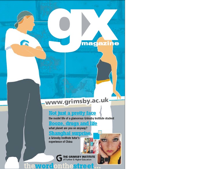
Ideology: Ideology is presented on the front cover on the text where it says "Booze, drugs and life, what planet are you on anyway?" which is trying to give the message the alchohol and drugs are not good things, as it is asking rhetorically whether the audience is on the planet of booze, planet of drugs or planet of real life. The contents page is trying to promote the idea that making an effort with education is a good thing as it features educational articles, and also featuring articles that discuss career opportunities. The photographs present the students as smiling, which promotes the idea that education is a good thing and an enjoyable experience. The slogan " The word on the street" which is featured at the bottom of both pages indicates that the college is popular which therefore encourages more students to read it and promote the idea of education.
Audience: This magazine is aimed at males and females between the ages of sixteen to nineteen who are students. We can tell this because on the front cover there are three pictures of students around the same age. The articles advertised on the front cover include "Not such a pretty face, the model life of a glamourous Grimsby Institute student" which will attract teenage females particularly because this is what they aspire to be like. Another article advertised is "Booze,Drugs and life. What planet are you on anyway" which will attract the attention of young people because alchohol and drugs is something they are curious about. On the contents page it features pictures of smiling students and pictures what give an idea of college life. This attracts the target audience because if they see that young people of the same age look happy at the college, then that is how they should also feel about college. They also want to achieve in education. The majority of the articles featured on the contents page are centred around the college, such as "Engineer your own future" and "Life on Campus" Which interests young students because they want to find out more about career paths, subjects they want to study and what the college has to offer.
Representation: Overall the college is represented in a positive way as on the front cover a bright blue background is used to stand out as this is a positive colour. The advertisement for the article "Booze, drugs and life" can be looked at negatively because alcohol and drugs are negative things to be associated with, however the college is trying to encourage students not to associate themselves with drugs or alcohol. On the contents page the college is represented in a positive way because all the students are smiling which tells the audience they are happy at that college. The font is also brightly coloured in colours like blue orange and green which are positive therefore reflect the college in a positive way. There are articles listed such as "Work based appreticeships" and "What a performance" which are encouraging students to suceed and take their education further, this shows the college in a good light because it shows they are encouraging young people to extend education and enter the workforce.
Monday, 11 October 2010
LIIAR Analysis of two College magazines
I have looked at two college magazines and analysed them using LIIAR.
http://www.eastridingcollege.ac.uk/retrieve/d2343bc1358b3983a89d916f6a988935
http://www.grimsby.ac.uk/documents/GX_mag/GX1.pdf
The first magazine I have analysed is the East Riding College magazine.


Language : The first thing I noticed was the front cover photo, which is taken with a group of people facing away from the camera looking towards the college. This identifies to the audience that this is a college magazine. The masthead is at the top of the magazine which is conventional, and the white font also stands out on the black background. The colours of back and white also match the colours of the photograph which is dull colour tones. It also has little text on the front cover which is a bad thing as it does not capture the audiences' attention very well.
The contents page is conventional because it says "Contents page" at the top which is what the audience expect. It also shows pictures around the wording, which is expected of a contents page in a magazine. The font and the border around the page are black which stands out on the white background. This is conventional because it is the same colours as the front cover. However, where the articles and page numbers are listed the colour is bright green, which contrasts with the black and white. This is done because bright colours attract the attention of young people.
Insitution : The institution that produced this magazine is East Riding College. We can tell this because on the front cover is the college logo on the bottom right, which is conventional of a college magazine because the audience want to know immediatly who produced the magazine. We can also tell the institution is the college as on the contents page there is pictures of students and their work.
Ideology: The ideology behind this media text is that they are trying the promote the idea of achievement. The pictures show pupils that appear pleased with their work and the producers are trying to make young people in the college belief that achievement is important. On the front cover in the bottom left hand corner the wording promotes ideology as it says things like "anti bullying" and "making a positive contribution" which promotes beliefs that bullying is not good and making positive contributions is a good thing.
Audience: The magazine is targeted at young people between 16 and 19 years old who are students, and also people who are interested in college life and education. We can tell it is aimed at this target group because the colour scheme on the front cover of black and white is quite a modern theme to use, therefore catches the attention of young people. On the contents page the colour green used against black font gives it a young feel. The contents page features photographs of young people and their work, which attracts the target audience because they can look up to it and believe they can also achieve because the people in the photographs are around the same age. The contents of the articles in the magazine also attracts this target group because some of the articles are subject specific, which will attract students interested in a certain subject. It lists an article about gap years and one about beauty which are both two subjects that young people are likely to be interested in.
Representation: This magazine appears to represent college in a positive way as on the contents page students and staff appear smiling on the pictures and photographs of students' work are used as if the college is trying to show off these pieces of work. It also shows on the contents that articles are about what is going on in college, giving the impression that there is a lot for students to be getting involved with. However, the front cover can be represented completley differently. This is because it uses black and white then negative tones for the photograph, which can be associated with sadness. It also shows the row of students with their backs the the camera, which means it is unpredictable how the students are feeling because the audience cannot see their facial expressions to tell this. However this could also be interpreted positively as it shows the students looking towards the college, which could mean it is somewhere they want to be and something they aspire to.
Thursday, 7 October 2010
LIIAR interpretation of brief
Language in a media text refers to the way messages are put accross. For example if a magazine were aimed at young people the colour and layout would be designed to attract young people, and the colours and wording would match with the theme of the product.
The Institution is the company where the text is produced. For example magazines are produced at magazine co operations. My College magazine will be produced at Wyke College.
The ideology is a set of attitudes, beliefs and values held in common by a group of people and culturally reproduced within that commuinity to sustain a particular way of life. To portray this in a Media text it needs to be considered how you want your audience to react to it, and the feelings you want to provoke in them. For example, a college magazine would have to feature articles that relate to young people and their attitudes, and the small commuinitiy which is pupils at the college.
The Audience is a target group of people that a Media text is aimed at. For example it could be aimed at females or males in particular age ranges. The college magazine I am producing will be aimed at 16-19 year old students.
Representation links to Ideology because it is based on how we see the world. It means how different genders and social groups are represented in the media. For example Women are generally portrayed differently to men in the media, therefore this makes the audience think that it is normal for women to look and act in a certain way. Representation can also be shown in symolism to show powerful meanings about social groups.
Outline of the Brief
Preliminary exercise : Using DTP and an image manipulation programme, produce the front page of a new school/ college magazine, featuring a photograph of a student in medium close up plus some appropriatley laid out text and a masthead. Additionally you must produce a mock-up of the layout of the contents page to demonstrate their grasp of DTP.
Subscribe to:
Comments (Atom)