
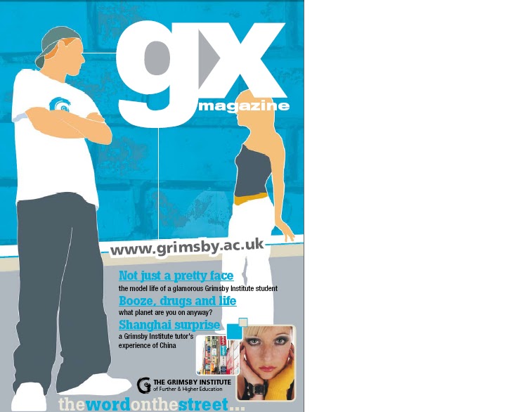
Language: The front cover of this college magazine features two pictures of students which are taken from real photographs but have been edited to appear animated. This is popular for a college magazine as it captures the audience's attention and also interests young people. The bright coloured blue background catches the audience's attention and helps the white coloured masthead stand out. The writing is placed in the middle at the bottom of the page, which is unconventional because we would normally expect it to be placed down the sides whith the model/ photograph in the middle. The contents page attracts the audiences attention because it features bright colours against a white background and this attracts teenage college students because it portrays the college as being bright and lively. The contents page is set out in a conventional way because the pictures are on the right hand side next to the contents which is on the left hand side.
Institution : The Institution that produced this magazine is Grimsby Institute College. The audience can tell the magazine is produced by them because the magazine has a youthful outlook, there a pictures of students featured on the contents page and in the contents there are articles which relate to education and the courses offered at the collge such as " Engineer your own future" and "Port of opportunity".
Ideology: Ideology is presented on the front cover on the text where it says "Booze, drugs and life, what planet are you on anyway?" which is trying to give the message the alchohol and drugs are not good things, as it is asking rhetorically whether the audience is on the planet of booze, planet of drugs or planet of real life. The contents page is trying to promote the idea that making an effort with education is a good thing as it features educational articles, and also featuring articles that discuss career opportunities. The photographs present the students as smiling, which promotes the idea that education is a good thing and an enjoyable experience. The slogan " The word on the street" which is featured at the bottom of both pages indicates that the college is popular which therefore encourages more students to read it and promote the idea of education.
Audience: This magazine is aimed at males and females between the ages of sixteen to nineteen who are students. We can tell this because on the front cover there are three pictures of students around the same age. The articles advertised on the front cover include "Not such a pretty face, the model life of a glamourous Grimsby Institute student" which will attract teenage females particularly because this is what they aspire to be like. Another article advertised is "Booze,Drugs and life. What planet are you on anyway" which will attract the attention of young people because alchohol and drugs is something they are curious about. On the contents page it features pictures of smiling students and pictures what give an idea of college life. This attracts the target audience because if they see that young people of the same age look happy at the college, then that is how they should also feel about college. They also want to achieve in education. The majority of the articles featured on the contents page are centred around the college, such as "Engineer your own future" and "Life on Campus" Which interests young students because they want to find out more about career paths, subjects they want to study and what the college has to offer.
Representation: Overall the college is represented in a positive way as on the front cover a bright blue background is used to stand out as this is a positive colour. The advertisement for the article "Booze, drugs and life" can be looked at negatively because alcohol and drugs are negative things to be associated with, however the college is trying to encourage students not to associate themselves with drugs or alcohol. On the contents page the college is represented in a positive way because all the students are smiling which tells the audience they are happy at that college. The font is also brightly coloured in colours like blue orange and green which are positive therefore reflect the college in a positive way. There are articles listed such as "Work based appreticeships" and "What a performance" which are encouraging students to suceed and take their education further, this shows the college in a good light because it shows they are encouraging young people to extend education and enter the workforce.
No comments:
Post a Comment