Friday, 22 October 2010

Evaluation


When creating  my College magazine the first thing I had to do was start researching images of college magazines. My target audience was students between the ages of sixteen and nineteen. To do this i looked on google at pictures of front cover and contents pages, and also analysed the front cover and contents pages of two college magazines, which helped me develop my ideas for my own. I decided to base my magazine on the college generally, and took a combination of long shots and medium shots around the college. To put my front cover and contents page together i experimented with different layouts and effects on photoshop, which helped me decide what suited my magazine best.

I decided to use blue as the font colour on the masthead because it is the colour of the wyke logo and also is a conventional colour to use in a magazine aimed at young people. I decided to use a different font on each word on the masthead because it stands out to catch the audience's attention, and also appears youthful. I used a mid shot of a student for my front cover page, which i then cut out and placed onto a background of a long shot which I took of the college grounds. I decided to do this because it is conventional to have a shot of a student on the front cover, and also there are students socialising in the background which gives the impression that Wyke has a good social atmosphere.
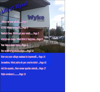
For the contents page i decided to use the colours of blue and a picture of the college entrance for the background, the blue to go with the front cover and the picture to show what the college looks like.I used a red font colour to stand out against the background and make it easy to read. I placed the pictures i have taken of groups of students and the front entrance of Wyke down the side and along the bottom as after looking at other college magazines i discovered this was conventional and went with the layout of the contents page.

The ideology of this magazine is that it portrays the idea that sucess in education is a good thing as the model on the front cover is holding her books, and also articles such as "Journalism. What paths do you need to take?" are featured in the contents. The magazine attracts the audience's attention because it features a young student on the front cover, and also features articles on the contents page which interest young strudents such as " Student executive. Who's got your vote?".

I used the photoshop effect Drop shadow on the masthead on the front cover, and on the "Life at Wyke" text on the contents page to make it stand out and catch the audience's attention. I used the outer glow on the text on the front cover to make it stand out and easy to read.

Front cover draft

As part of my planning i have produced a draft copy of my front cover.
I have decided not to use this because the green font on the lower part of the page blends with the background colour making it difficult to read. The masthead on this draft is also slightly off centre, which puts it out of proportion. I have decided to keep the font on the mastead because dark blue is the colour of the Wyke logo and it also stands out on the white section of the background. I also would like to make the background appear brighter as in this draft it looks dull compard with the level of brightness on the model.
I will be using the masthead on this draft for my final piece as i think it is well suited to the target audience, and dark blue is also the colour of the Wyke logo.  I also cropped the model out from another photograph I had taken using the lasso tool on photoshop and pasted her over this background.

This is a hand drawn draft of my orignal idea for the magazine. I decided not to put my masthead like this because it would take up too much space and make the front cover look over crowded. This draft helped me decide to have a medium shot of one model central on my front cover, as this immdiatly catches the audience's attention because it is a photograph of a young person holding books, which helps the audience establish that it is a college magazine.


These are two shots i took as part of my planning stage. These shots show ideology in that they both portray Wyke college as having a good social atmosphere. I decided not to use these because they are both long shots, and i throught a medium shot looked better on the front cover as it gives a closer view of the model.


This was orginally going to be my final draft for the contents page, however I decided that the pink colour with the outer glow was not easy enough to read, therefore I have decided to change the font colour to red.

This was originally going to be my final front cover, however the model has red eye on it, and also a date needs to be included.

Thursday, 14 October 2010

LIIAR Analysis of two college magazines


 Language: The front cover of this college magazine features two pictures of students which are taken from real photographs but have been edited to appear animated. This is popular for a college magazine as it captures the audience's attention and also interests young people. The bright coloured blue background catches the audience's attention and helps the white coloured masthead stand out. The writing is placed in the middle at the bottom of the page, which is unconventional because we would normally expect it to be placed down the sides whith the model/ photograph in the middle. The contents page attracts the audiences attention because it features bright colours against a white background and this attracts teenage college students because it portrays the college as being bright and lively. The contents page is set out in a conventional way because the pictures are on the right hand side next to the contents which is on the left hand side.

Institution : The Institution that produced this magazine is Grimsby Institute College. The audience can tell the magazine is produced by them because the magazine has a youthful outlook, there a pictures of students featured on the contents page and in the contents there are articles which relate to education and the courses offered at the collge such as " Engineer your own future" and "Port of opportunity".

Ideology:  Ideology is presented on the front cover on the text where it says "Booze, drugs and life, what planet are you on anyway?" which is trying to give the message the alchohol and drugs are not good things, as it is asking rhetorically whether the audience is on the planet of booze, planet of drugs or planet of real life. The contents page is trying to promote the idea that making an effort with education is a good thing as it features educational articles,  and also featuring articles that discuss career opportunities. The photographs present the students as smiling, which promotes the idea that education is a good thing and an enjoyable experience. The slogan " The word on the street" which is featured at the bottom of both pages indicates that the college is popular which therefore encourages more students to read it and promote the idea of education.

Audience: This magazine is aimed at males and females between the ages of sixteen to nineteen who are students. We can tell this because on the front cover there are three pictures of students around the same age. The articles advertised on the front cover include "Not such a pretty face, the model life of a glamourous Grimsby Institute student" which will attract teenage females particularly because this is what they aspire to be like. Another article advertised is "Booze,Drugs and life. What planet are you on anyway" which will attract the attention of young people because alchohol and drugs is something they are curious about. On the contents page it features pictures of smiling students and pictures what give an idea of college life. This attracts the target audience because if they see that young people of the same age look happy at the college, then that is how they should also feel about college. They also want to achieve in education. The majority of the articles featured on the contents page are centred around the college, such as "Engineer your own future" and "Life on Campus" Which interests young students because they want to find out more about career paths, subjects they want to study and what the college has to offer.

Representation: Overall the college is represented in a positive way as on the front cover a bright blue background is used to stand out as this is a positive colour. The advertisement for the article "Booze, drugs and life" can be looked at negatively because alcohol and drugs are negative things to be associated with, however the college is trying to encourage students not to associate themselves with drugs or alcohol. On the contents page the college is represented in a positive way because all the students are smiling which tells the audience they are happy at that college. The font is also brightly coloured in colours like blue orange and green which are positive therefore reflect the college in a positive way. There are articles listed such as "Work based appreticeships" and "What a performance" which are encouraging students to suceed and take their education further, this shows the college in a good light because it shows they are encouraging young people to extend education and enter the workforce.

Monday, 11 October 2010

LIIAR Analysis of two College magazines

I have looked at two college magazines and analysed them using LIIAR.
http://www.eastridingcollege.ac.uk/retrieve/d2343bc1358b3983a89d916f6a988935
http://www.grimsby.ac.uk/documents/GX_mag/GX1.pdf

The first magazine I have analysed is the East Riding College magazine.


Language : The first thing I noticed was the front cover photo, which is taken with a group of people facing away from the camera looking towards the college. This identifies to the audience that this is a college magazine. The masthead is at the top of the magazine which is conventional, and the white font also stands out on the black background. The colours of back and white also match the colours of the photograph which is dull colour tones. It also has little text on the front cover which is a bad thing as it does not capture the audiences' attention very well.
The contents page is conventional because it says "Contents page" at the top which is what the audience expect. It also shows pictures around the wording, which is expected of a contents page in a magazine. The font and the border around the page are black which stands out on the white background. This is conventional because it is the same colours as the front cover. However, where the articles and page numbers are listed the colour is bright green, which contrasts with the black and white. This is done because bright colours attract the attention of young people.

Insitution : The institution that produced this magazine is East Riding College. We can tell this because on the front cover is the college logo on the bottom right, which is conventional of a college magazine because the audience want to know immediatly who produced the magazine. We can also tell the institution is the college as on the contents page there is pictures of students and their work.

Ideology: The ideology behind this media text is that they are trying the promote the idea of achievement.  The pictures show pupils that appear pleased with their work and the producers are trying to make young people in the college belief that achievement is important. On the front cover in the bottom left hand corner the wording promotes ideology as it says things like "anti bullying" and "making a positive contribution" which promotes beliefs that bullying is not good and making positive contributions is a good thing.

Audience: The magazine is targeted at young people between 16 and 19 years old who are students, and also people who are interested in college life and education. We can tell it is aimed at this target group because the colour scheme on the front cover of black and white is quite a modern theme to use, therefore catches the attention of young people. On the contents page the colour green used against black font gives it a young feel. The contents page features photographs of young people and their work, which attracts the target audience because they can look up to it and believe they can also achieve because the people in the photographs are around the same age. The contents of the articles in the magazine also attracts this target group because some of the articles are subject specific, which will attract students interested in a certain subject. It lists an article about gap years and one about beauty which are both two subjects that young people are likely to be interested in.

Representation: This magazine appears to represent college in a positive way as on the contents page students and staff appear smiling on the pictures and photographs of students' work are used as if the college is trying to show off these pieces of work. It also shows on the contents that articles are about what is going on in college, giving the impression that there is a lot for students to be getting involved with. However, the front cover can be represented completley differently. This is because it uses black and white then negative tones for the photograph, which can be associated with sadness. It also shows the row of students with their backs the the camera, which means it is unpredictable how the students are feeling because the audience cannot see their facial expressions to tell this. However this could also be interpreted positively as it shows the students looking towards the college, which could mean it is somewhere they want to be and something they aspire to.

Thursday, 7 October 2010

LIIAR interpretation of brief

Language in a media text refers to the way messages are put accross. For example if a magazine were aimed at young people the colour and layout would be designed to attract young people, and the colours and wording would match with the theme of the product.

The Institution is the company where the text is produced. For example magazines are produced at magazine co operations. My College magazine will be produced at Wyke College.

The ideology is a set of attitudes, beliefs and values held in common by a group of people and culturally reproduced within that commuinity to sustain a particular way of life. To portray this in a Media text it needs to be considered how you want your audience to react to it, and the feelings you want to provoke in them. For example, a college magazine would have to feature articles that relate to young people and their attitudes, and the small commuinitiy which is pupils at the college.

The Audience is a target group of people that a Media text is aimed at. For example it could be aimed at females or males in particular age ranges. The college magazine I am producing will be aimed at 16-19 year old students.

Representation links to Ideology because it is based on how we see the world. It means how different genders and social groups are represented in the media. For example Women are generally portrayed differently to men in the media, therefore this makes the audience think that it is normal for women to look and act in a certain way. Representation can also be shown in symolism to show powerful meanings about social groups.

Outline of the Brief

Preliminary exercise : Using DTP and an image manipulation programme, produce the front page of a new school/ college magazine, featuring a photograph of a student in medium close up plus some appropriatley laid out text and a masthead. Additionally you must produce a mock-up of the layout of the contents page to demonstrate their grasp of DTP.